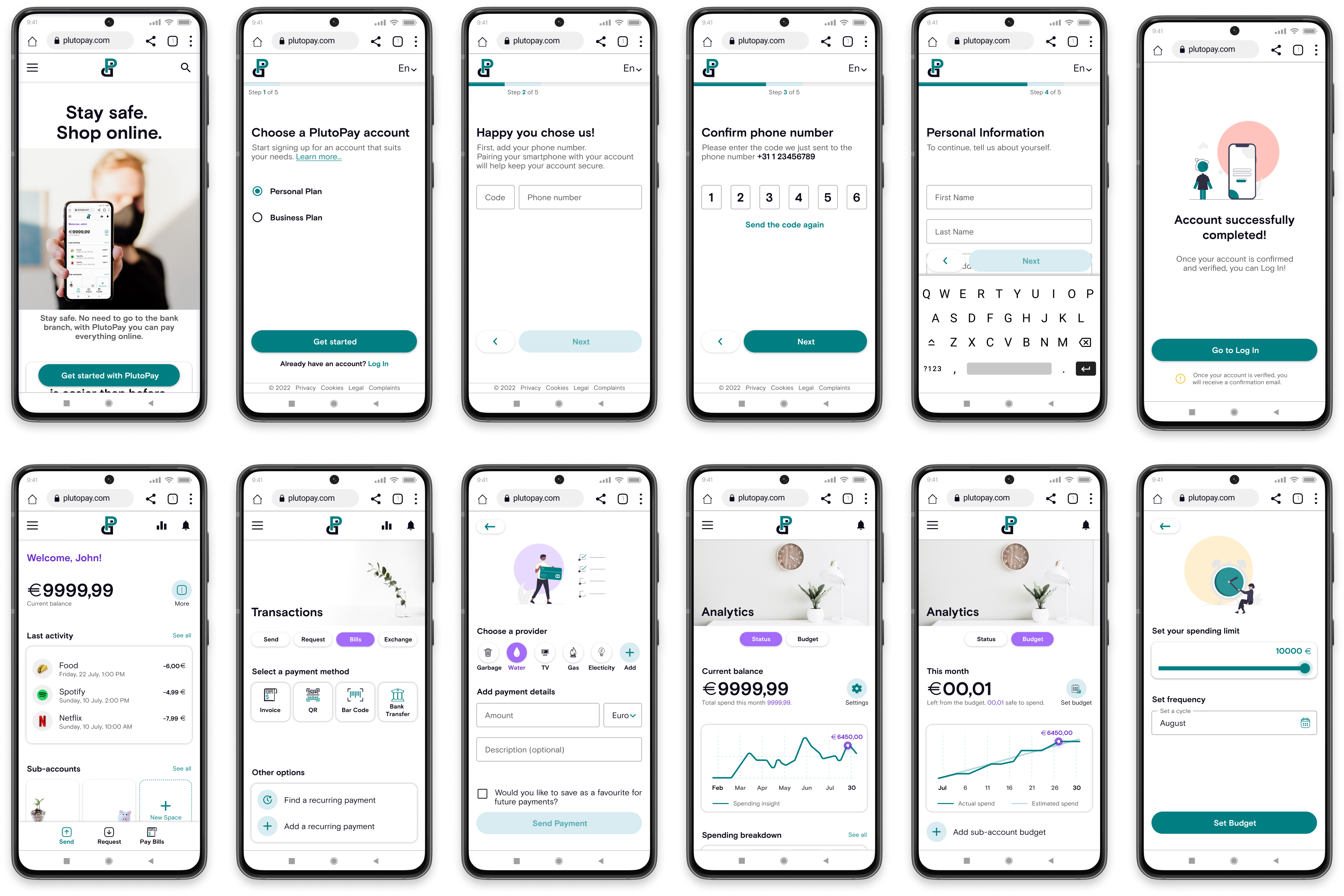
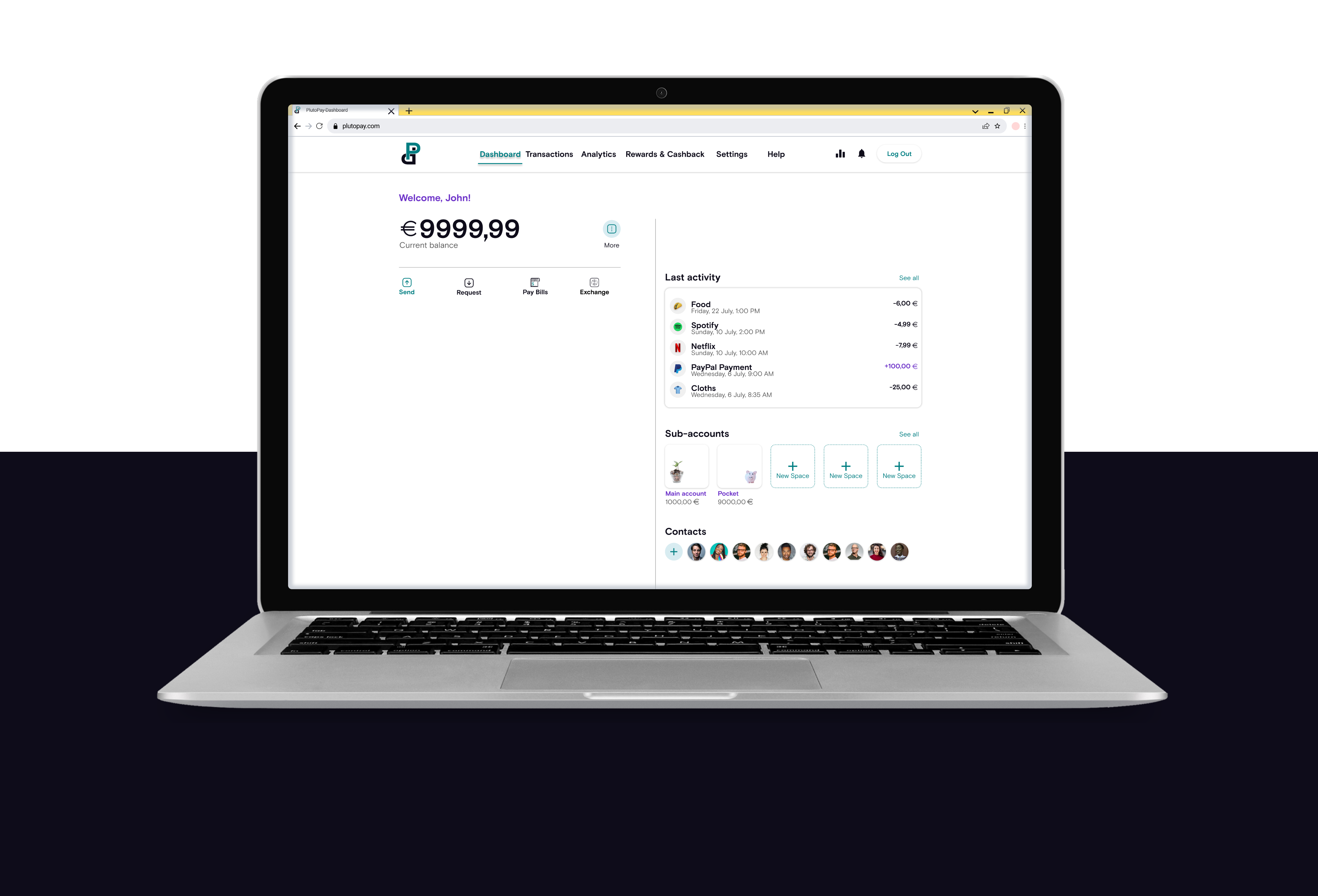
PlutoPay

UX/UI Case Study 2022-2023 | Digital Banking Platform
Market Research
Competitive Analysis
Targeted Audience
Survey
User Interviews
Affinity Mapping
User Persona
User Journey Map
Mental Model
User Flows
Sitemap
Card Sorting
Wireframes
Responsive Design
Mid-Fidelity Prototype
Usability Testing
Preference Testing
Rainbow Spreadsheet
High-Fidelity UI
Collaborative Design
Style Guide

Project

A Mobile-First Responsive Web Application created as part of the UX/UI Design certification program at CareerFoundry.

Role

UX Researcher | UX Designer
| UI Designer

Timeline

8 months

Tools

Figma, Adobe XD, Adobe Creative Suite, Google Survey, Optimal Workshop, Diagrams.net, Mural, Google Drive & Forms

Deliverables

User Experience Research, High-Fidelity Wireframes & Clickable Prototype, User Interface Design, Design Language System

Why did I make this project?

"As part of my UX/UI Design certification program, I received 4 project topics and chose to explore the digital banking domain. I was particularly interested in understanding how the modern digital banking platforms support everyday financial activities."

Market Research

“The pandemic has caused an accelerated growth and has brought new audiences online. In 2020, 71% of the EU population made purchases online (as opposed to 66% in 2019 and 64% in 2018).”

Problem

The rapid growth of online users has changed the way people make purchases and financial transactions. During the COVID-19 pandemic, due to forced isolation, many people avoided crowded areas and physical interaction.

However, many existing banking solutions still relied on in-person interactions, required users to manage multiple credit or debit cards for different services, or offered complicated digital payment processes.

Because of this, users needed a simpler and more secure way to complete essential financial transactions without relying on debit or credit cards or visiting a physical bank branch.

Opportunity - Simplifying digital banking

How might we develop a simpler and more accessible digital platform to enable users to manage payments and transactions without relying on physical debit or credit cards?

Basic Goals

Goals achieved as PlutoPay to be considered successful:

Two-Factor Authentication
Basic Plan
Transactions
Filter Past Behavior

Higher Goals

Future goals

Flexible Plans
Rewards & Cashback
Travel Plan & Exchange

Sustainable Goals

Future goals

Rewards for:
Living Green & Healthy

  1. Design Thinking Process

01. Empathize

Understanding the User

Let's get started.

"PlutoPay was the most complex project developed during the UX Design Bootcamp, with a focus on UX Research and UX Design.

I received a project brief with the initial business requirements and goals. Because the guidelines were flexible, the project evolved based on the market research and user insights.

This stage included 2 Competitive Analyses, a Survey (19 responses), and 4 User Interviews to understand how people currently manage online payments."

Competitive Analysis

To understand the market, I conducted 2 Competitive Analyses by studying banking platforms with similar digital banking features. This helped me understand the existing solutions, what was successful, and what was missing.

I considered PayPal and Revolut as the main potential competitors for this project.

However, for UX analysis and feature comparisons during design development, I consulted multiple platforms, such as N26, ING, Bunq, Google, and others.

What was the target audience?

After gaining insights into the market, I defined the target audience that I contacted for further User Research.

Target audience. Individuals who regularly use digital banking platforms and want to make easy, safe, and secure transactions without multiple credit or debit cards.

The target demographic for PlutoPay ranged from 18 to 20 years old, depending on legal maturity, with an upper age limit of 40.

Understanding user needs

"Although it was an optional task, I decided to conduct a Survey because PlutoPay included several complex features.

Understanding which features users rely on most, and which needs were local versus global, helped me focus and prioritize on the essential needs first."

  1. User Research

  2. After defining my target audience and understanding the market, I moved to User Research. These research methods helped me better understand the users' needs, motivations, and behavior.

Survey

Since PlutoPay was designed as a global platform, the main goal of the Survey was to collect insights from a larger group of users with different demographic backgrounds.

User Interviews

Based on the Survey feedback, I created the User Interview script.
The purpose was to dig deeper into users' experiences when interacting with existing digital banking platforms and how COVID-19 influenced their needs.

Affinity Mapping

Using the information collected from the User Interviews, I grouped the key insights into meaningful categories, labelled them, and later translated them into features that defined PlutoPay.

Prioritizing the features

Based on the Affinity Mapping results, I discovered that the biggest challenge was maintaining users' confidence while finishing their financial tasks. This could be possible by providing a simpler, clearer, and more intuitive digital banking platform.

Due to time constraints, I focused on the 4 most essential features for launching PlutoPay. This allowed me to define a free basic product version that helps users manage their finances and understand the platform.

Core Features (MVP)

Sign Up
Log In
Pay Bills
Budgeting

02. Define

Who was I designing for?

Prioritize User Personas

"During research, I was able to identify multiple User Personas: Marc, Suzan, Michelle, and Tom.

Due to time constraints, I decided to focus the MVP on the needs of Marc and Suzan.

Marc needs a secure platform to protect his financial information, while Suzan, a busy mother, needs a simple, clear, and intuitive platform to complete her financial tasks quickly.

Michelle, a digital nomad who needs to manage multiple currencies, and Tom, an eco-friendly person committed to a healthy lifestyle, I decided to consider them for Higher and Sustainable Goals.

  1. Have you met Marc and Suzan?

  2. Throughout User Research and Affinity Mapping, I identified shared needs, behaviors, and pain points, and focused on providing solutions for Marc and Suzan Personas. These personas were kept in mind throughout the design process to ensure I was designing for real people and solving real problems.

03. Ideate

Starting the Ideation Process

Moving into the design phase.

"Once I had organized the User Research insights, prioritized PlutoPay features, and defined the target User Personas, it was time to translate these findings into design decisions and define the core structure of the product.

This stage included 2 Mental Models and User Journey Maps for Marc and Suzan, 3 Task Analyses and User Flows, a Sitemap, and Low- and Mid-Fidelity Wireframes."

Mental Model &
Users Journey Map

Based on the Personas' goals, I identified the key steps Marc and Susan take to accomplish their tasks. These were mapped into 2 Mental Models and 2 User Journey Maps to understand their interactions.

Task Analysis &
User Flows

Using the Mental Models as guidance, I translated the tasks into 3 User Flows. These flows covered creating a new account and accessing the existing account, paying bills, and setting a budget limit.

Sitemap

The information architecture provides an overview of PlutoPay's functionality.
I conducted 2 Open Card Sorting sessions with Optimal Sort to gather enough information about the before and after Log In/Sign Up.

  1. User Flows

  2. The User Flows were created in FigJam. This helped translate tasks from the Mental Models into screens and actions, resulting in optimized flows that support Marc and Suzan in completing their tasks.

    Below are the user flows for creating an account (Marc) and setting a budget limit (Susan).

  1. Sitemap

  2. After analyzing several related and unrelated financial platforms, I created the Sitemap in Diagrams.net.
    The Sitemap consists of two layers: the primary layer provides general information about the platform, and the secondary layer provides access to the financial features.

Refining user goals.

"Although the Mental Model exercise was optional, it helped me to understand users' everyday behaviors and workflows.

Due to time constraints and the complexity of the Sitemap, I focused on 3 essential User Flows for PlutoPay: Log In and Sign Up, Pay Bills, and Budgeting.

The process continued with sketching early concepts on sticky notes, and progressed from Low-Fidelity Wireframes to Mid- and High-Fidelity Wireframes and interactive Prototypes, following a Mobile-First Design approach."

Sticky Notes

Because I am a detail-oriented person, to keep the process fast and simple, I started by sketching the first ideas on sticky notes.

Working with small frames helped me to focus on core ideas without being distracted by unnecessary details.


Low-Fidelity Wireframes

I continued by translating the sticky notes into more detailed 1:1 paper and pencil Wireframes.

Since the sketches take a few minutes, I analyzed, self-critiqued, and iterated the structures and interactions multiple times before sharing them with my tutor and mentor.

Mid-Fidelity Wireframes

I used Figma to transition from Paper Wireframes to Mid-Fidelity Wireframes and Prototyping, defining key functionality and more accurate screens.

I designed the navigation patterns, created reusable component layouts, and set grids and spacing to optimize and ensure the project's consistency from the beginning.

Mobile-First Design

Using a Mobile-First Design approach, I prioritised essential information for users and structured content for smaller screens first, starting with the mobile version before designing for tablet and desktop breakpoints.

04. Prototyping

Build an Interactive Prototype

High-Fidelity Wireframes & Clickable Prototype

I transitioned from Mid- to High-Fidelity Wireframes, defining UI components to ensure PlutoPay met all the requirements for Sign Up, Log In, Pay Bills, and Budgeting.

Using Figma allowed me to iterate efficiently while applying consistent UI patterns and principles.

Prototyping was the key to demonstrating how users can interact with the platform and preparing the product for Usability Testing.

05. Test

Test, test, test

Validating the hypothesis

"The goal of this stage was to validate the hypothesis and evaluate how real users interact with PlutoPay. Before finalizing the prototype for Usability Testing, I conducted a pilot session with friends.

This stage included a Usability Test (6 participants), 3 Preference Tests (12 responses), and the Rainbow Spreadsheets method to prioritize insights by severity."

Usability Testing

Goal. Assess how new users interact with the High-Fidelity Prototype of PlutoPay.

I observed and measured whether the users understood the platform, its value, and how they completed core tasks.

Affinity Mapping &
Rainbow Spreadsheet

Iterations. I created an Affinity Mapping to organize the insights gained during Usability Testing feedback.
Further, I used the clues' information for the Rainbow Spreadsheets and prioritized the key insights by severity.

Preference Testing

Iterations. Based on the Affinity Mapping insights, I iterated the 5 most critical errors found during Usability Testing.
I selected 3 additional critical errors for the Preference Testing session in which users had difficulty understanding the screen’s content.

Working within time constraints.

"Given time constraints, I conducted one Usability Testing session and iterated on the design based on the findings.
Furthermore, I used Preference Testing to validate alternative UI solutions and improve the experience.

If I had more time, I would have conducted a second Usability Testing session to validate the iterations implemented."

06. Visual Design

“fast, simple, and intuitive”

Ensuring design consistency.

"After defining the PlutoPay platform structure, validating it with real users, and iterating on critical issues, during this stage, I refined the prototype by applying UI design principles.

This stage included:
PlutoPay Design Language System, including responsive grids and breakpoints, reusable UI components, and an accessibility check to meet WCAG 2.0 AA standards.

The outcome was a set of
46 polished High-Fidelity Wireframes and a final interactive prototype."

  1. PlutoPay Style Guide

  1. Responsive Grids and Breakpoints

  2. I defined a responsive layout grid and set breakpoints to ensure consistency across devices. The system uses 4 columns for mobile, 8 for tablet, and 12 for desktop, with gutters of 8, 16, and 24 px, respectively.

  1. Accessibility check

  2. The platform’s color contrast was evaluated using a Color Contrast Checker to meet WCAG 2.0 AA standards. I also conducted a full accessibility audit to ensure AA guidelines and to define a strategy to reach AAA standards.

  1. Final Solution

  2. I designed 46 High-Fidelity Wireframes because I wanted to support key User Flows and navigation patterns, such as Sign Up for new users and Log In for existing users. Also, I wanted to incorporate a complex security structure and multiple features.

Try PlutoPay prototype!

Future Steps

PlutoPay was developed as an evolving platform. The next steps include additional Usability Testing sessions to validate recent iterations, refine existing features, and fully define flows for Transactions and Analytics.

Regarding the visual design, I would like to explore a Dark Mode solution that allows users to choose what is most comfortable, especially for those with visual impairments.

Future goals. During User Research, additional hypotheses were identified for further exploration, including Rewards & Cashback, Rewards for Living Green & Healthy for users like Tom, and Exchange functionality tailored for users like Michelle.

  1. Learnings & Reflections

  2. My initial goal was to design a secure digital banking platform that supports online shopping, transactions, money exchange, and rewards for spending and sustainable behaviors. However, the scope became too broad, making it difficult to focus.

    During the research process, I learned to prioritize goals and focus on core users’ needs in order to deliver a viable product for PlutoPay. After all, working with constraints increased creativity.

    Meeting multiple challenges, I gained deeper knowledge about UX Design, Design Thinking and User-Centered Design processes.

  3. Top 4 Takeaways:
    Research: Investing enough time in research to understand future users reduces unnecessary iterations.
    Design for users and not for me. Focus on user needs and align solutions with users’ mental models.
    Collaborate: Collaborating with other designers improves understanding of both process and functionality.
    Test, test, test: Continuous testing is essential for validating assumptions and observing real user interaction with the product.

  4. What I would do differently?
    1. Focus on fewer features while ensuring complete end-to-end User Flows.
    2. Conduct additional Usability Testing to validate iterations.
    3. Run a second round of User Research focused on core goals.
    4. Collaborate more closely with developers to learn to prioritize iterations based on technical constraints

  1. Other projects

  2. Home - Real Estate Platform
    Read Case Study ➜

Let’s get in touch!

Copyright © 2023 Silvia Alexandrescu