Home

UX/UI Case Study 2022-2023 | Real Estate Platform
Market Research
User Persona
User Flows
Sitemap
Mid-Fidelity Prototype
Wireframes
Usability Testing
High-Fidelity UI
Responsive Design
Style Guide
Mood Board
Iconography

Project

A Mobile-First Responsive Web Application created as part of the UX/UI Design certification program at CareerFoundry.

Role

Existing UX Research |
UX Designer | UI Designer

Timeline

2 months

Tools

Figma, Adobe Creative Suite, Optimal Workshop, Diagrams.net, Google Drive & Forms

Deliverables

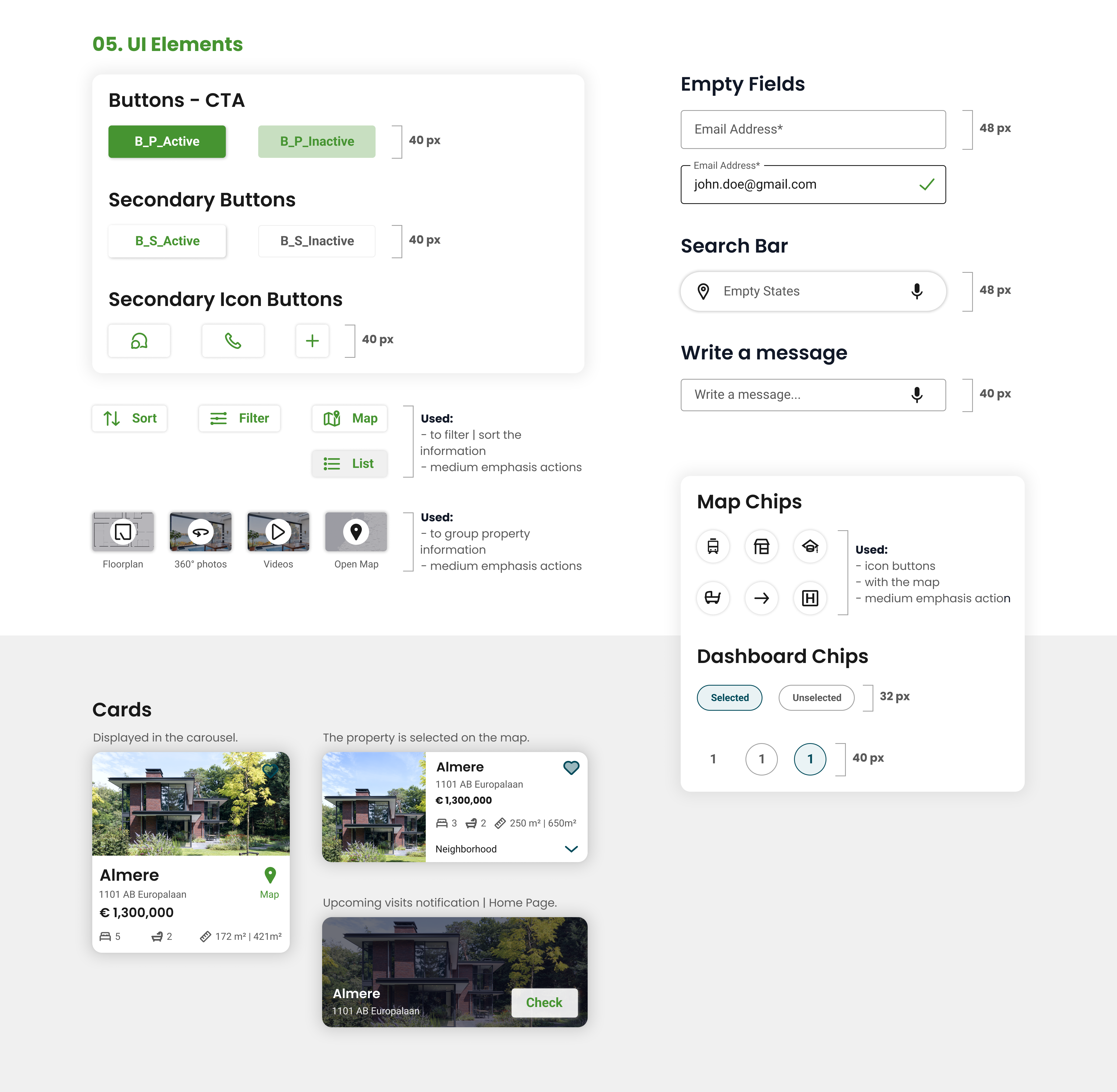
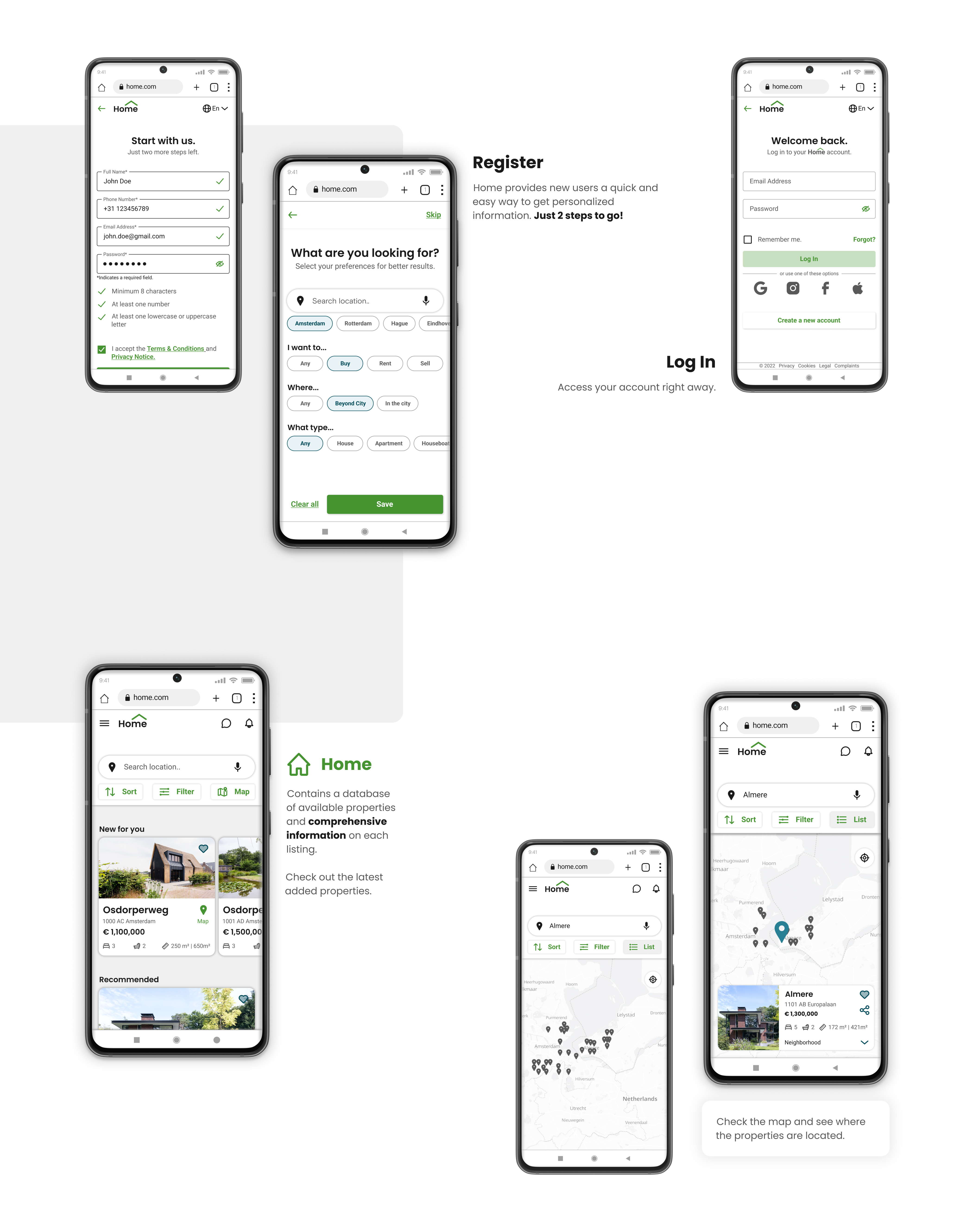
High-Fidelity Wireframes & Clickable Prototype,
Mood Board, Visual Style Guide, Iconography

Why did I make this project?

"I wanted to use my background in architecture and my personal experience navigating the Dutch housing market.

As part of my UX/UI Design certification with UI Design Specialization, I received 4 project topics and chose to focus on the real estate domain because of my interest in how design can improve the property search experience.

Home was designed to help new, small-scale property buyers looking for properties beyond the city so that they could invest for additional income or financial security."

Market Research

Despite the economic crisis, relocation to rural areas across Europe has become a major trend during COVID-19. 45% of people were in 2022 more likely to buy a property than they were last year.

Problem

- Property investment is an increasingly popular way for individuals to achieve financial security.

- Buying a property is a highly complex process, and often becomes a stressful experience.

- Plenty of blogs and agencies provide too much information, which leads users to spend time on properties outside their budget.

- Buyers new to the market struggle to get started without having professional guidance.

Opportunity

- User-friendly, Responsive Design. Home contains a database of available properties and comprehensive information on each listing available anytime on any device.

- Personalized Account. The filters are available during registration and property search, so the properties listed match buyers' interests.

- Perfect for unseasoned buyers who need access to reliable, uncomplicated information about their potential property investments.

- Let’s chat or book a visit. Professional guidance provided by a real estate agent.

Basic Goals

Filter Properties
Property Profile
Share & Save
Contact the Agent
Book a Visit

Who was I designing for?

Project context

"The project builds on pre-existing UX research that defines the problem space, design criteria, and a primary persona, Rashida, highlighting key goals and frustrations.

My role was to design an intuitive real estate platform that helps users like Rashida in making informed property investment decisions. The focus was on UX and UI Design."

  1. To get started, let’s meet Rashida.

  2. At the start of the project, I conducted a Competitive Analysis to understand the local and European real estate market, which informed my design decisions.

    Using insights from the project brief, I developed the primary persona, Rashida, to highlight user goals and frustrations. I used User Stories to showcase the key features.

    Rashida represents first-time property buyers who need clear information and intuitive platforms when searching for properties.

    Below are the key insights that influenced the design decisions for creating Home.

Ideate, Prototype & Test

Moving into the design phase

"Once I had organized the gathered information, identified key insights for Rashida, and prioritized Home platform features, it was time to translate the User Stories into User Flows and Low-Fidelity Wireframes.

This part included
3 User Flows, a Sitemap, Low- to Mid-Fidelity Wireframes, and a Prototype used to conduct Usability Testing (3 participants)."

  1. User Flows

  2. To define the key user interactions, I created 3 User Flows diagrams in FigJam outlining the main tasks Rashida needs to complete: Register, Filter Properties, and Book a Visit. Two key User Flows are shown below.

Organizing information to improve usability

"Although not part of the initial project requirements, I chose to include a Sitemap and a Card Sorting exercise to better structure the information architecture and support my design decisions.

Due to time constraints, the focus was on the key User Flows and defining an MVP."

  1. Sitemap

  2. After analyzing several related and unrelated platforms, I created a Sitemap in FigJam to define the Home platform's overall structure and organize its screens and User Flows.
    I conducted a minimal Closed Card Sorting session (5 participants) using the Optimal Workshop platform to validate the content structure, improve clarity, and enhance findability.

User Flows and prototype validation

"Even though the project focused on UI design principles, being part of the UI Design Specialization, I chose to introduce a small Usability Testing session to validate the proposed User Flows and ensure the experience supports user needs.

If I had more time, I would have conducted a second Usability Testing session to validate the iterations implemented.

I used the Mid-Fidelity Prototype as support during testing sessions, enabling early validation and quick iteration.

The usability testing results are presented below.

  1. Iterative Design

  2. Having the User Persona, Sitemap, and User Flows, I could start the first sketches for the mobile version. Since I was using pen and paper, I could quickly organise and iterate fast on the information until I had all the necessary functionality properly organized. The focus was on showing basic information without wasting time on unnecessary details.

    I used Figma to refine the wireframes and create a Mid-Fidelity Prototype, which was later used to test the prototype's usability with real users.

    The platform's development process involved several iterations, simultaneously working on Wireframes and User Flows until I created the best version of Home.

    Below, I have displayed the design decisions and iterations for the Home Page and Property Profile screens.

Visual Design

Ensuring design consistency.

"Once the Mid-Fidelity Prototype and Usability Testing feedback were incorporated, I refined the design and applied visual design principles.

I defined a Style Guide for Home alongside the first wireframes in Figma, which ensured consistency throughout the process and enabled faster iteration.

This stage included:
2 Mood Boards and a Design Language System for Home, including customized icons, responsive grids and breakpoints, UI components, and an accessibility check to meet WCAG 2.0 AA standards.

The outcome was a set of
41 polished High-Fidelity Wireframes and a final interactive Prototype."

  1. Define the design direction. Mood Board

  2. The first step was to create 2 Mood Boards exploring different visual directions, from which I chose the most representative. This helped define how users will interpret the Home platform's visual content and establish a clear visual style aligned with the Dutch real estate market.

  1. Home Style Guide

  2. Based on the visual direction defined in the mood board, I established a set of rules to ensure a consistent and minimal design. This ensures the correct use of typography, color palette, imagery, iconography, and UI components.

    For layout and grid system, I defined a responsive grid with breakpoints, using a 4-column layout for mobile, 8 for tablet, and 12 for desktop. Spacing follows a 4px system.

    I used the Material Design system as a foundation to structure UI elements and patterns. Below is a selection from the Style Guide.

  1. Final solution

  2. I had 41 High-Fidelity Wireframes because I had different navigation patterns for Sign In or Create an account, 4 different navigation flows for Searching for a property, and I also showcased the result after Booking a visit.

Try Home prototype!

Future Steps

Home was designed as a scalable product with opportunities for continuous development.

UX Research and Design. To further improve the prototype, additional Usability Testing sessions will be conducted to validate future iterations. Moving to the next stage, expanding the platform to include Sell and Rent features, presents an opportunity to attract a broader audience.

Visual Design. I plan to conduct A/B Testing to improve usability and evaluate whether the visual direction is effectively communicated.

Future goals. UX Research and design for Sell and Rent features, as well as implementing optional filters for sustainable properties.

  1. Other projects

  2. PlutoPay - Digital Banking
    Read Case Study ➜

Let’s get in touch!

Copyright © 2023 Silvia Alexandrescu